
DETOUR / DEVELOPMENT LOG
Day 2 — Making the HUD Disappear
Moving health, fuel, and progress out of debug text and into the world of DETOUR.
Originally published on itch.io ↗. Reproduced here from the original post.
Day 1 was about answering one question:
Can I get DETOUR playable from start to finish?
The answer was yes.
It was ugly, almost everything was made from colored rectangles, and the UI looked like debug information — but the complete loop existed.
Day 2 was about a different question:
Can the game tell the player what they need to know without constantly putting numbers in the corner of the screen?
That turned into a surprisingly interesting design problem.
Starting Point: The Debug HUD
At the beginning of the day, DETOUR communicated almost everything through permanent text:
HEALTH: 3FUEL: 62HOME: 4 STOPS
It worked.
But it didn’t feel like a driving game.
It felt like a prototype explaining itself.
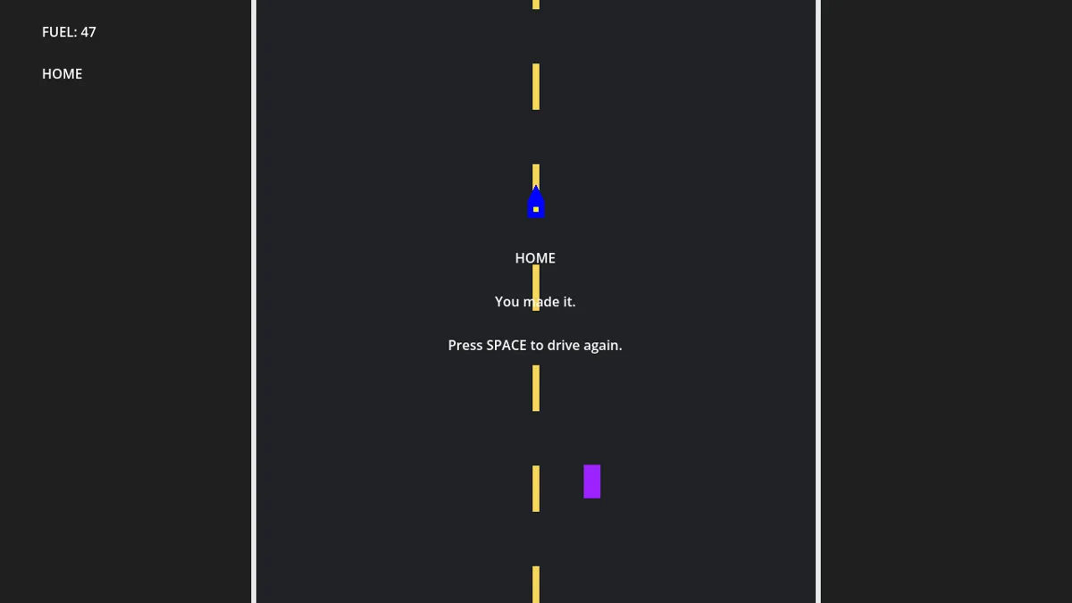
The goal for today became removing as much of that permanent HUD as possible without removing the information the player actually needs.
That distinction ended up guiding almost everything I worked on.
Health Moved Onto the Car
The first thing to go was the health counter.
The player only has three health states anyway, so showing a number felt unnecessary.
Instead, the car itself now communicates its condition.
Internally, there are still three health points:
- 3 — Good
- 2 — Damaged
- 1 — Critical
But the player doesn’t need to see those numbers.
As the car takes damage, its visual state changes instead.
The current implementation is still placeholder art, but the system is there:
- damage marks become visible
- smoke begins appearing
- the damaged state becomes increasingly obvious
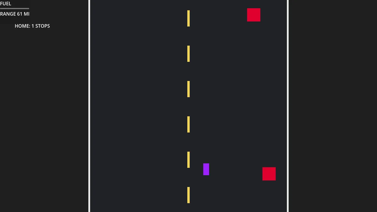
The important test was simple:
If I remove
HEALTH: 3, can I still tell when I’m one hit away from wrecking?
That is ultimately what matters.
Later, the placeholder damage effects can become actual dents, broken lights, smoke, sparks, and rougher engine audio.
But the information no longer needs to live in a number.
Fuel Became Range
Fuel was a different problem.
Unlike health, fuel directly affects route decisions.
At a junction, the player might see:
SHORTCUT
6 MI
ROUGH
versus:
DETOUR
14 MI
CLEAR
If the HUD says:
FUEL: 37
…that doesn’t actually tell the player very much.
37 what?
How far does that get me?
Can I afford the 14-mile road?
So I changed the fuel model.
Instead of presenting raw fuel, DETOUR now calculates the car’s remaining range in miles.
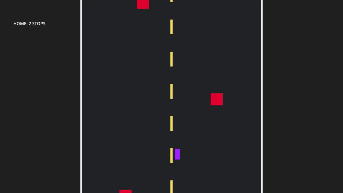
The current tuning uses:
- 100 maximum fuel units
- 1.6 fuel units per mile
- 0.22 simulated miles per second
That gives a full tank roughly:
62 miles of range
Now the game can present:
RANGE 18 MI
next to:
SHORTCUT — 6 MI
DETOUR — 14 MI
And suddenly the decision requires almost no explanation.
If I have 18 miles of range, I know immediately that the detour is possible…
…but it is going to leave me nearly empty.
That feels much closer to the kind of decision I want DETOUR to create.
The Route Distance Became Real Too
Once fuel was measured in miles, the route lengths needed to mean something.
Previously, shortcut and detour simply changed arbitrary fuel-burn values.
That worked mechanically, but it wasn’t very elegant.
Now the route length controls how long the player actually drives before reaching the next junction.
A 6-mile shortcut takes roughly:
27 seconds
A 14-mile detour takes roughly:
64 seconds
The detour uses more fuel because the player actually travels farther.
Not because the game secretly increases fuel consumption after selecting it.
That made the whole system much easier to reason about.
It also created a small bug.
At one point, I stopped the route timer when a junction appeared…
…and forgot to restart it after the player selected a route.
The result was a perfectly functional road that continued scrolling forever.
No next junction.
No home.
Just road.
That was fixed by restarting the route timer after the player’s decision, with the timer duration calculated from the selected mileage.
Making the Dashboard Contextual
Even after switching to range, I still didn’t want:
RANGE 61 MI
permanently sitting in the corner of the screen.
So the fuel display became a contextual dashboard.
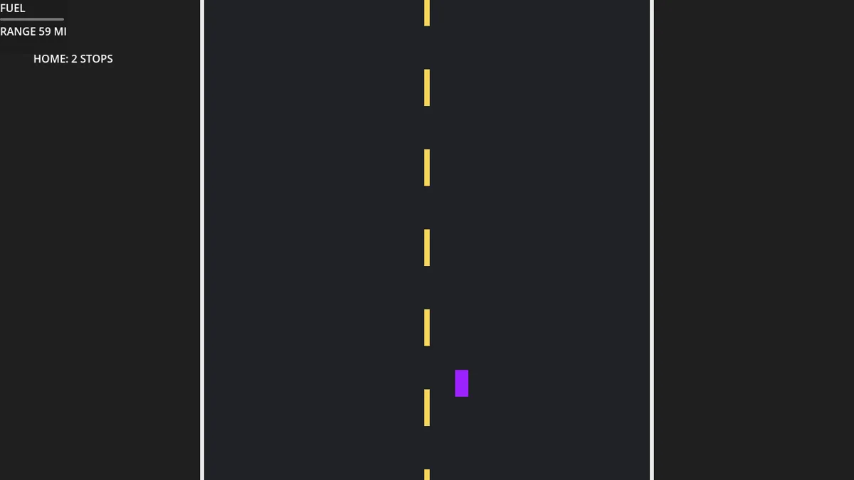
The dashboard now appears when the information is useful:
- briefly when the run begins
- when a junction approaches
- after collecting fuel
- whenever fuel becomes critically low
During ordinary driving, it fades away.
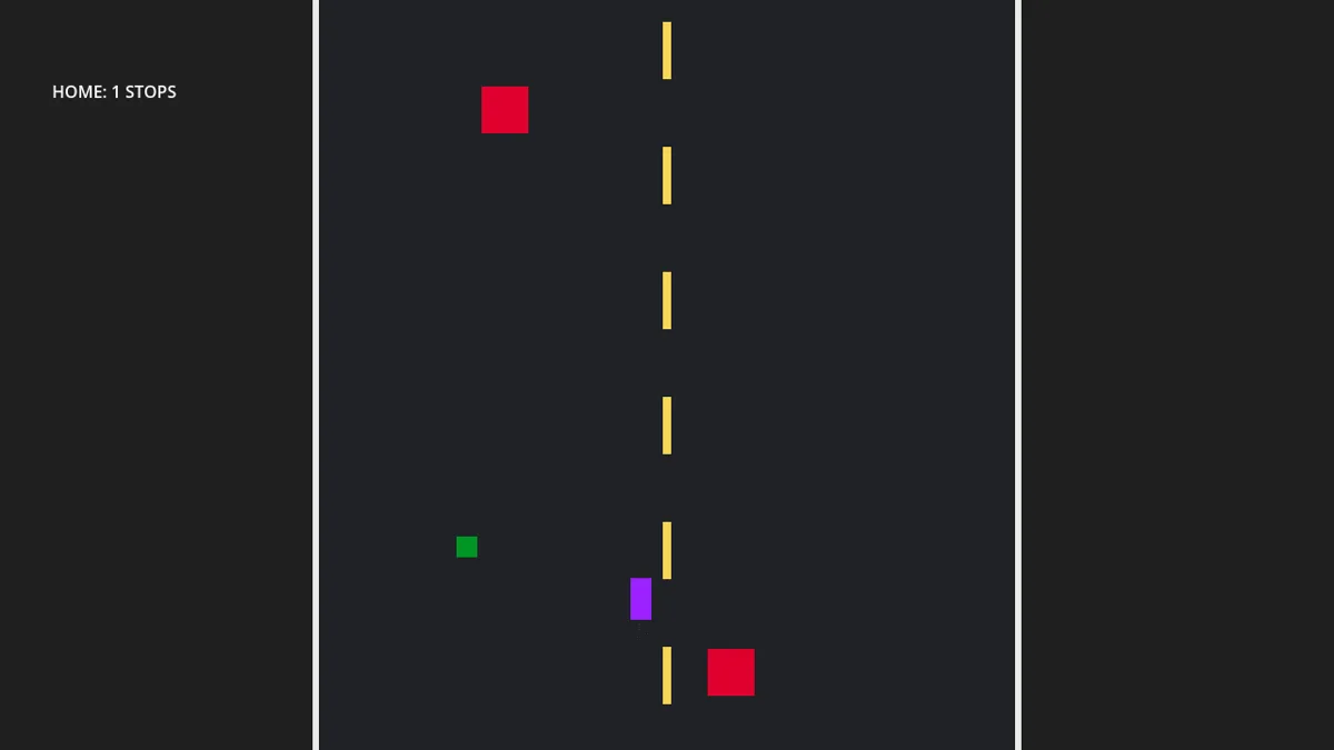
This is still a very rough version of the dashboard.
Eventually I’d like it to feel like an actual instrument cluster — probably an analog fuel gauge with a range readout and a low-fuel warning light.
But even this prototype proved the interaction.
The screen feels cleaner while driving, and the information returns exactly when the player needs to make a decision.
Removing HOME: X STOPS
The last permanent debug element was:
HOME: 2 STOPS
It was functional.
It also made absolutely no sense inside the world.
Nobody drives down a highway and sees:
HOME: TWO GAMEPLAY JUNCTIONS REMAINING
So I moved progress into the environment too.
Now roadside signs scroll into view:
HOME — 1 MI
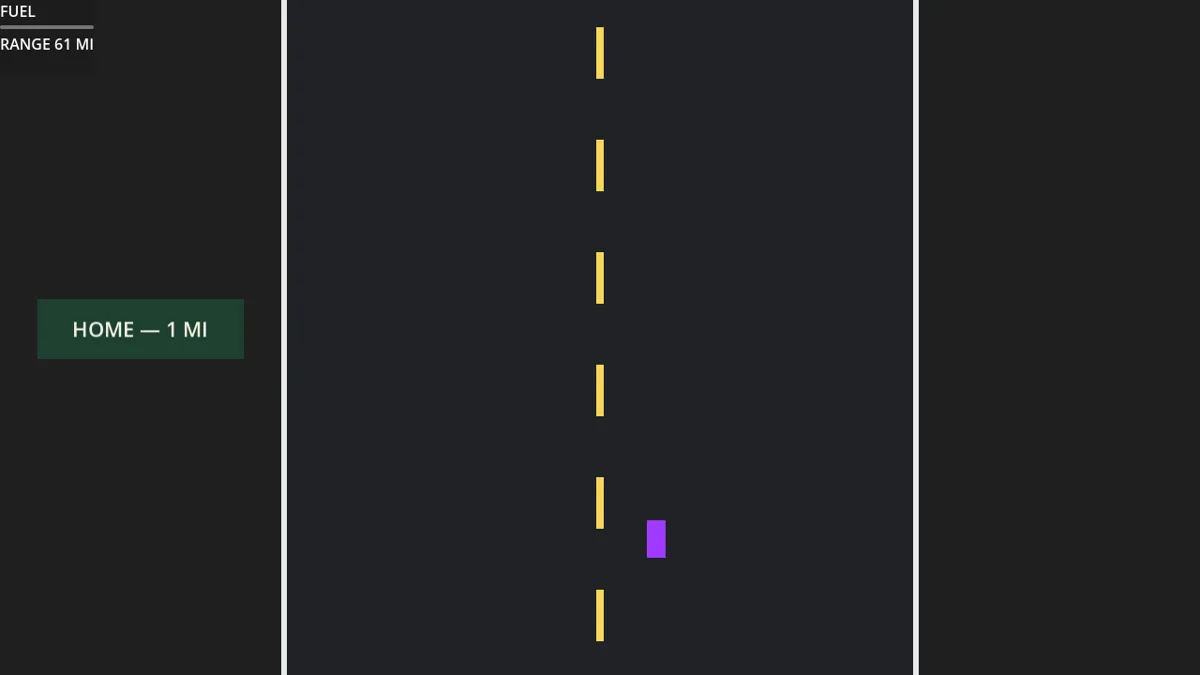
This one change made a much bigger difference than I expected.
It makes progress feel like part of the journey instead of part of the interface.
Eventually the run can include signs such as:
- HOME — 38 MI
- HOME — 27 MI
- HOME — 16 MI
- HOME — 7 MI
And those values can respond to the routes the player chooses.
For now, the system exists and the permanent HOME: X STOPS counter is gone.
The Game Is Starting to Communicate Through the World
By the end of today, the information structure looks much more like this:
Health
→ condition of the car
Fuel
→ contextual dashboard and remaining range
Progress
→ roadside mileage signs
Route choice
→ physical junction signs
Danger
→ the road itself
That is a lot closer to what I want DETOUR to feel like.
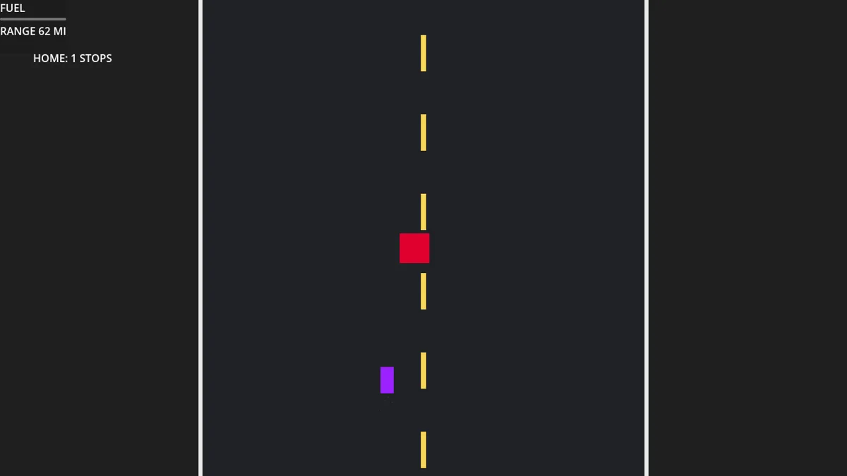
The game is still extremely placeholder-heavy.
The car is still a purple rectangle.
The obstacles are still red squares.
The fuel pickup is still green.
But the structure underneath them is getting stronger.
The Biggest Lesson From Day 2
The most useful thing I learned today was:
Removing UI isn’t the same thing as removing information.
Players still need to know:
- how damaged they are
- how much farther the tank can take them
- how far they are from home
- what each road choice will cost
The problem isn’t that those things are displayed.
The problem is where and how they are displayed.
Moving that information into the car, dashboard, and road signs makes the game feel more coherent without making it harder to understand.
That is the direction I want to keep pushing.
Where DETOUR Is Now
After Day 2, the prototype has:
- left/right steering
- scrolling road
- obstacle spawning
- collision knockback
- three internal health states
- visual damage communication
- mileage-based fuel consumption
- remaining-range calculation
- fuel pickups
- contextual dashboard behavior
- shortcut/detour decisions
- route lengths that affect actual travel time
- roadside home-distance signs
- finite progression
- home arrival
- win and lose states
- restart
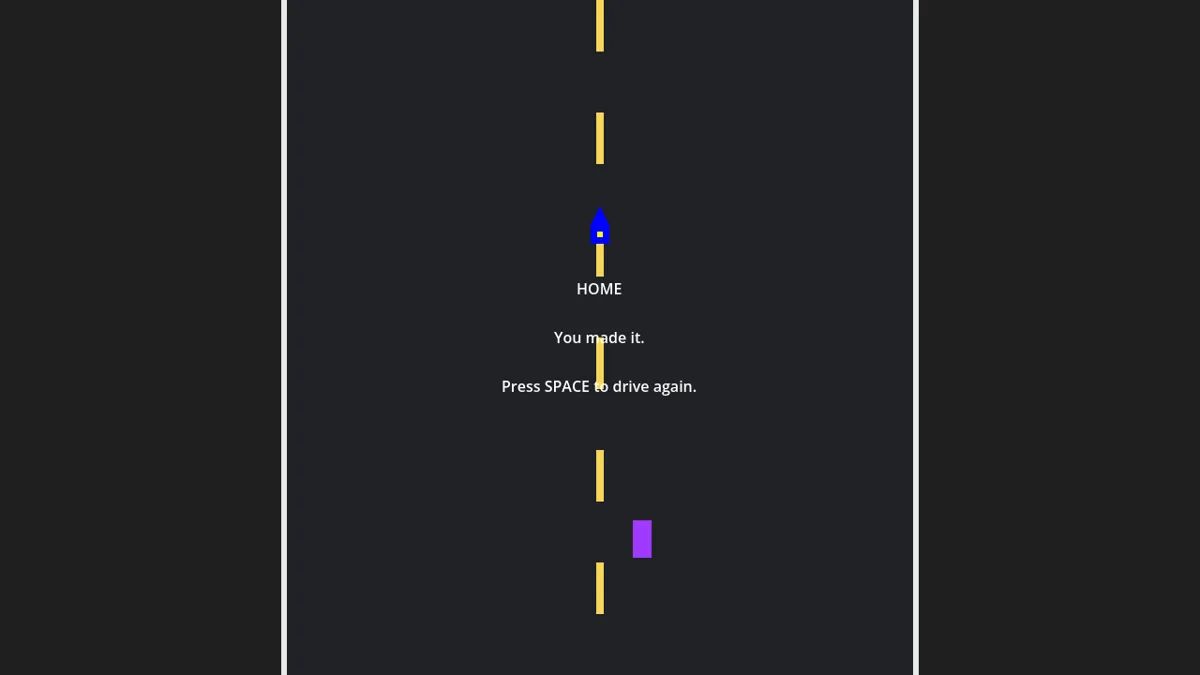
The gameplay itself didn’t radically change today.
The way the game communicates that gameplay did.
And I think that was the right thing to work on.
Next
The next step is finally starting to move away from pure prototype visuals.
The systems are reaching the point where I can start replacing:
- purple rectangle → car
- red square → actual hazards
- green square → fuel can
- plain road → nighttime environment
- temporary dashboard → actual instrument cluster
- temporary signs → proper roadside signage
But I still want to keep the same rule from Day 1:
Polish the game that already exists before adding more game.
There are plenty of ideas for where DETOUR could eventually go.
For the jam, though, the goal is still simple:
Finish one memorable road home.
5 days left.
One road home.
No time for wrong turns.