
DETOUR / DEVELOPMENT LOG
Day 4 — Turning Out the Lights
Adding headlights, illuminated highway signs, obstacle shadows, glowing fuel, and a warm-lit destination.
Originally published on itch.io ↗. Reproduced here from the original post.
Day 3 was mostly about making the car feel better.
Day 4 was about making the world around it feel like a place.
Up until now, DETOUR had been taking place on what was basically a perfectly visible road floating in a dark gray void. That was fine while I was figuring out mechanics, but it never really matched the premise.
The game starts at 11:47 PM.
You are driving home.
The highway is closed.
You are taking unfamiliar roads through the middle of the night.
So today I finally turned the lights off.
Making Night Actually Feel Like Night
The first step was adding a CanvasModulate to darken the entire world.
That immediately changed the game more than I expected.
The road edges disappeared into darkness. Obstacles became harder to identify at a distance. The yellow lane markers became little reflective anchors instead of just lines moving down the screen.
But naturally, making everything dark created another problem:
I could no longer see anything.
So, the next step was headlights.
I added two PointLight2D nodes to the Player scene and built soft radial gradient textures for them.
The first version was basically just two circles of light.
Then I stretched them vertically, moved them forward from the car, adjusted their overlap, and spent a while tuning how wide the illuminated area should be.
The goal wasn’t realism.
The goal was enough visibility to drive while still making the darkness matter.
Eventually I landed on something that feels surprisingly convincing for how simple it is.
The car now carries a moving pool of visibility through the world, and because the lights move with the steering, the road actually feels like it is being revealed in front of you.
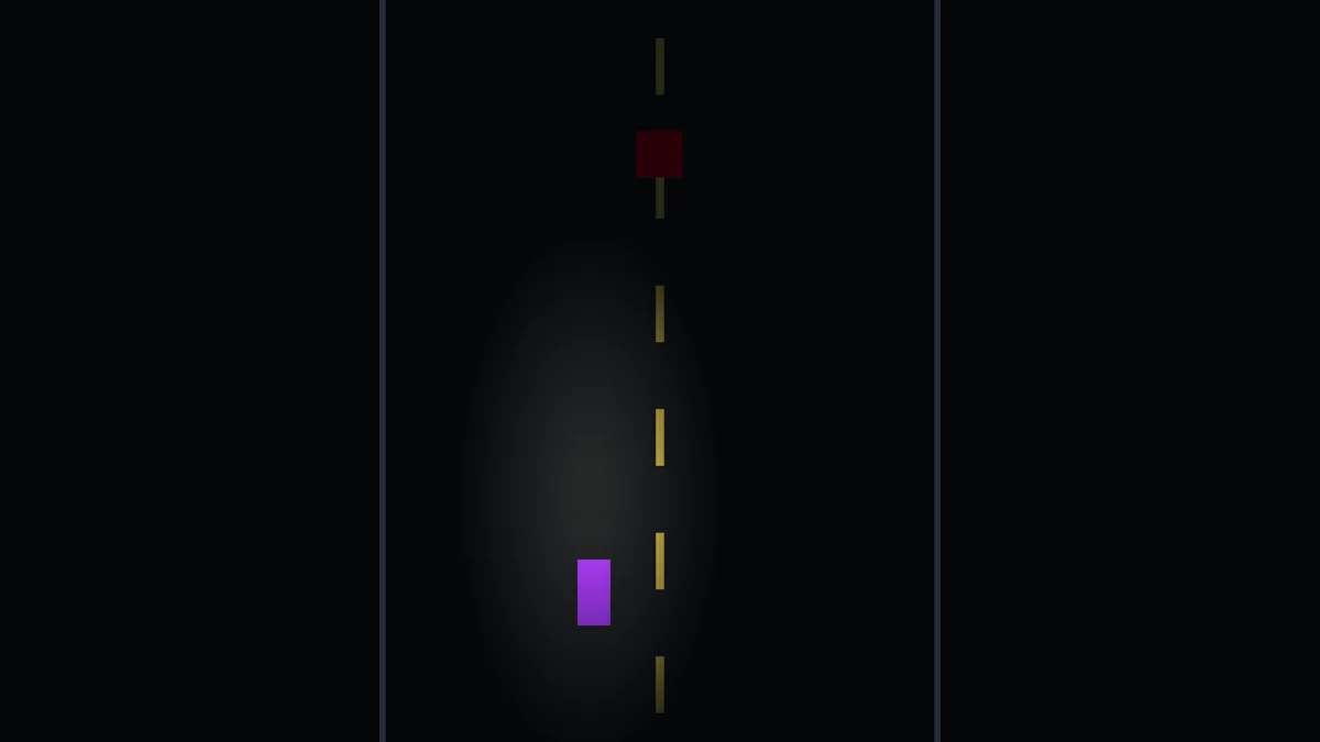
This was probably the biggest visual transformation the game has had so far.
Yesterday it still looked very much like a prototype.
Today it started feeling like a nighttime driving game.
The Darkness Broke the Route Signs
Of course, once I got the headlights working, I discovered that the route-choice system had a new problem.
The old route choices were just floating text:
SHORTCUT       DETOUR
6 MI           14 MI
ROUGH          CLEAR
That was readable when the entire road was evenly lit.
At night, it looked strange.
Worse, depending on where the headlights were pointing, one side of the choice could be significantly darker than the other.
That sent me down another rabbit hole:
What if the route choices were actual highway signs?
So, I built a reusable HighwaySign scene.
The scene currently contains:
HighwaySign
  Border
  SignPanel
  TitleLabel
  DistanceLabel
  ConditionLabel
  ArrowLabel
  LampHousingLeft
  LampHousingRight
  SignLightLeft
  SignLightRight
The signs use a dark green panel, white lettering, a white border, and two small, mounted lights.
The lights use the same basic gradient system as the headlights but shaped much wider and shallower so they wash across the sign face instead of lighting the road.
I also added a small script so the same scene can be configured with different text.
That means the route fork can now create:
SHORTCUT
6 MI
ROUGH
↓
DETOUR
14 MI
CLEAR
↓
without maintaining two completely separate sign designs.
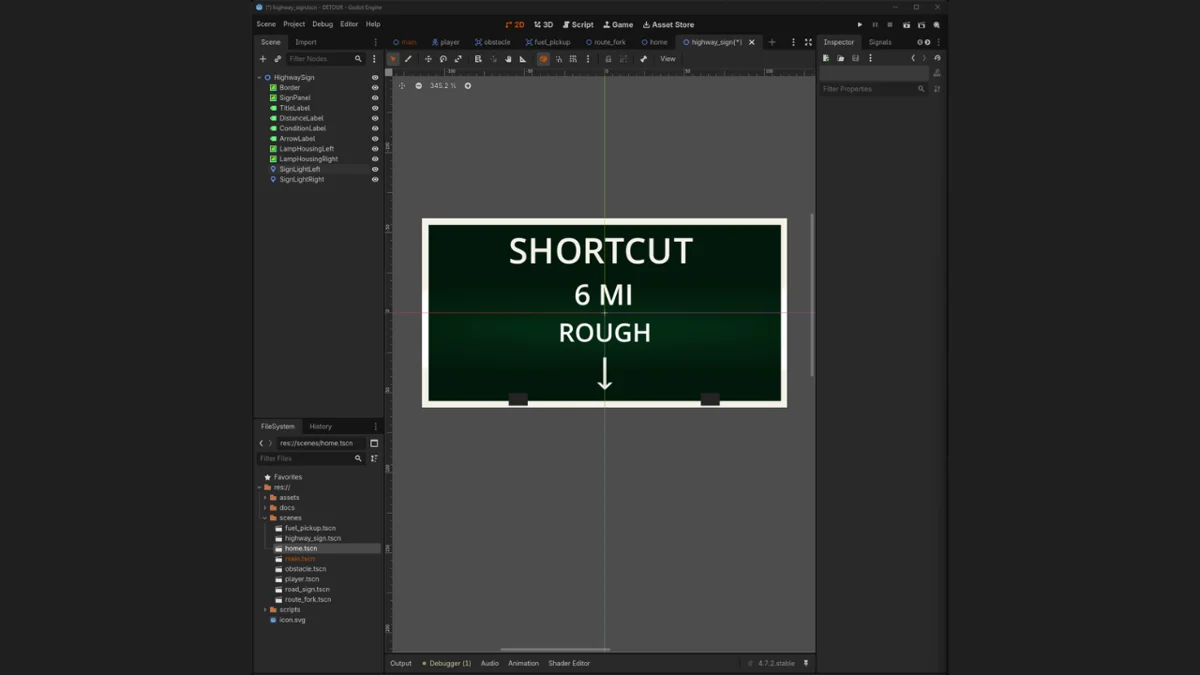
This ended up being a good example of a feature becoming more useful because of a visual problem.
I started trying to fix readability.
I ended up with a reusable environmental object.
Turning a Menu Into Part of the Road
Once the new signs were working, I replaced the old floating labels in the route fork.
At first I put the signs on the shoulders.
That looked decent, but the player still had to mentally translate:
left sign means left route right sign means right route
Eventually I moved the signs inward so each one sits directly above the lane it represents. That was much better.
Now the spatial layout itself communicates the choice.
     SHORTCUT          DETOUR
       6 MI             14 MI
       ROUGH            CLEAR
         ↓                ↓

       LEFT             RIGHT
The player doesn’t really need instructions anymore.
You read the signs and drive underneath the one you want.
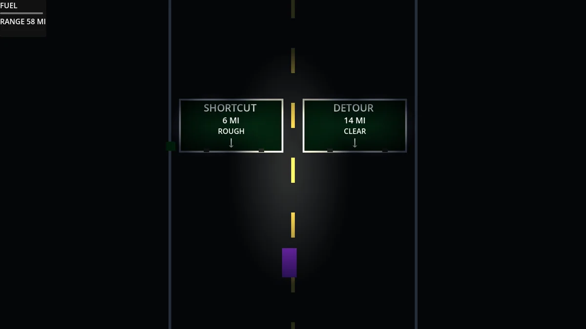
This is becoming one of my favorite parts of the game.
It still performs the exact same mechanical job as the old text did, but now it feels like something that belongs inside the world.
Shadows
Once I had actual light sources moving around, I wanted to know whether objects could block them.
So I added a LightOccluder2D to an obstacle.
The first test was hilarious.
The obstacle cast an enormous, perfectly sharp black wedge across the road.
Technically correct.
Visually ridiculous.
I enabled filtered shadows and gradually increased the smoothing until the shadow stopped looking like a giant triangle and started behaving more like something you notice subconsciously.
With both headlights enabled, the effect became even better.
Each headlight casts the obstacle slightly differently, so the shadows overlap and partially fill one another.
The result is subtle.
And that is exactly what I wanted.
When driving, I don’t really think:
Wow, look at that shadow.
The obstacle just feels like it has more volume than it did yesterday.
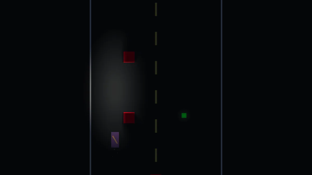
That may be one of today’s bigger lessons:
Sometimes an effect is working best when you stop noticing the effect itself.
Making Fuel Visible Without Turning It Into a Power-Up
Darkness also made the fuel pickups harder to see.
That was a gameplay problem, because obstacles only need to be avoided.
Fuel has to be noticed early enough that the player can intentionally move toward it.
I didn’t want to turn the pickup into a giant neon collectible, though.
So I gave it a very small green PointLight2D.
Just enough glow that, even outside the headlights, you can tell:
There’s something over there.
Then when it enters the headlight beam, it becomes much more obvious.
The obstacle remains visually dominant as a threat, while the fuel is visible enough to register as an opportunity.
That feels like the right hierarchy.
Home Needed to Feel Different
The last lighting problem was the ending.
Previously, home was basically a bright blue house icon.
It worked mechanically.
It did not feel like coming home.
With the rest of the game now taking place in darkness, I realized I had an opportunity to make the ending visually different from everything that came before it.
So I rebuilt the tiny house using a dark body and roof, then added a warm window and a warm exterior light.
The color contrast does most of the work.
The road is cold and dark.
The headlights are functional.
The signs are green and reflective.
Then, at the end of the run, there is a small warm light waiting ahead.
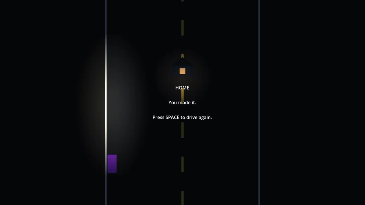
It’s still extremely simple art.
But now the ending communicates something before the text even appears.
That’s probably the first time DETOUR has had a visual element that feels connected to the emotional idea behind the game.
Day 4 Takeaway
Today started with:
Let’s try adding headlights.
And somehow became:
- nighttime world lighting
- two moving headlights
- custom gradient textures
- reusable illuminated highway signs
- environmental route choices
- filtered obstacle shadows
- glowing fuel pickups
- and a warm-lit destination at the end of the road
The underlying game did not change very much.
You are still steering around obstacles, collecting fuel, choosing routes, and trying to get home.
But the way those same systems feel changed dramatically.
The biggest lesson today was that lighting isn’t just decoration.
It changed readability.
It changed how I designed the route signs.
It changed how fuel needed to communicate itself.
It changed how obstacles felt.
And it gave me a way to make arriving home feel different from the rest of the drive.
There are still plenty of rectangles on the screen.
They’re just rectangles standing in much better lighting now.
And somehow that made a very big difference.